Static Svelte: JavaScript Blogging with 93% less JavaScript
Why Svelte is a Perfect Fit For Blogging
This blog now uses Svelte & Sapper as a static site generator, where it previously used React & Gatsby. This is achieved through Sapper’s sapper export feature.
Through the magic of Netlify’s Immutable Deploys, we can directly compare them on representative live URL’s for a recent blogpost of mine:
- With React/Gatsby: 138kb
- With Svelte/Sapper: 9kb
- For the curious, I also recently wrote about using Next.js as a Static Site Generator as well, but don’t expect much difference.
⚠️To be very clear - this post is not even close to being an apples to apples benchmark, and I spend some effort below explaining why it isn’t. If you aren’t prepared to read this post with a critical mind and understanding that this is a random work in progress report, please stop here.
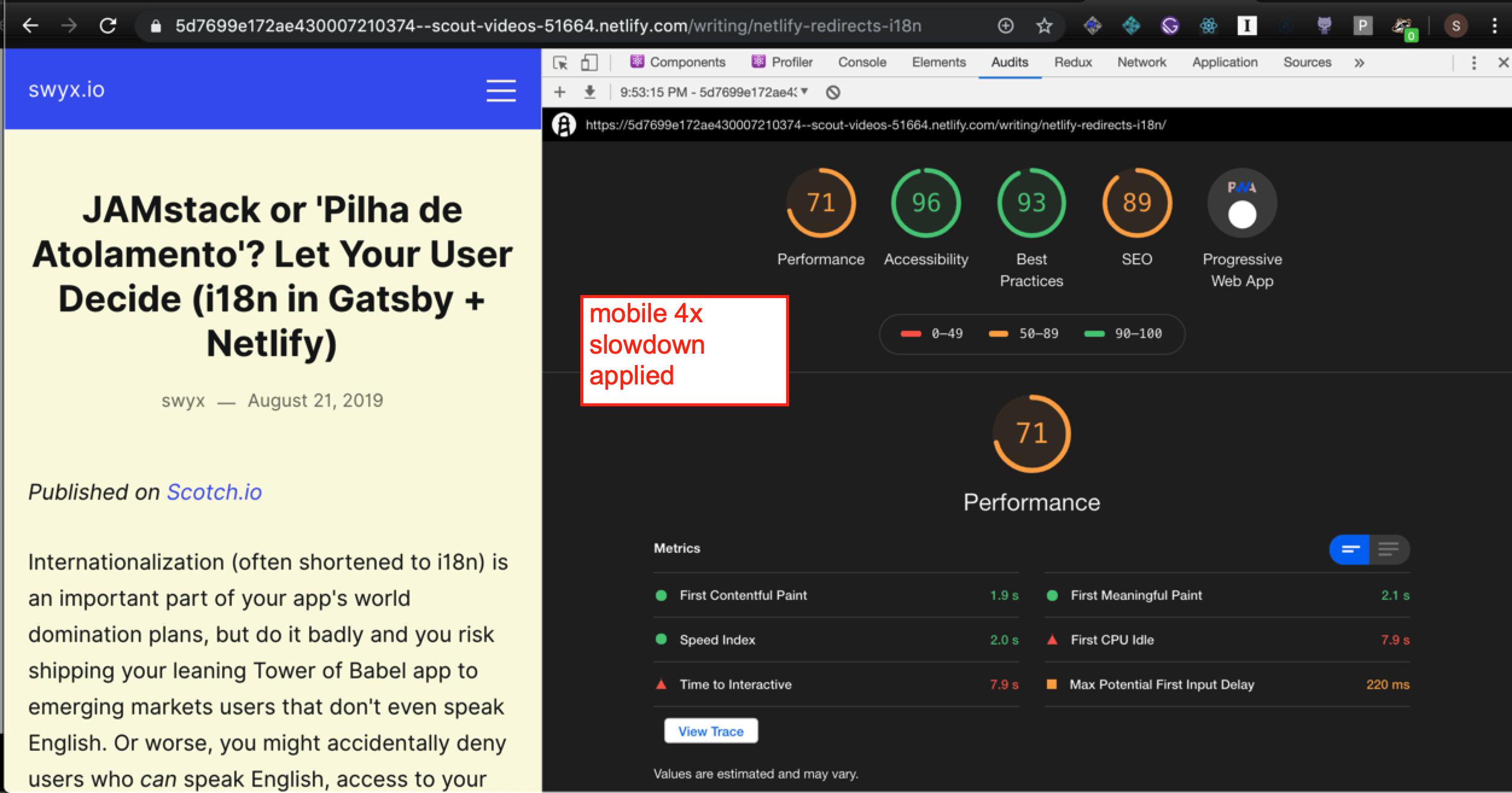
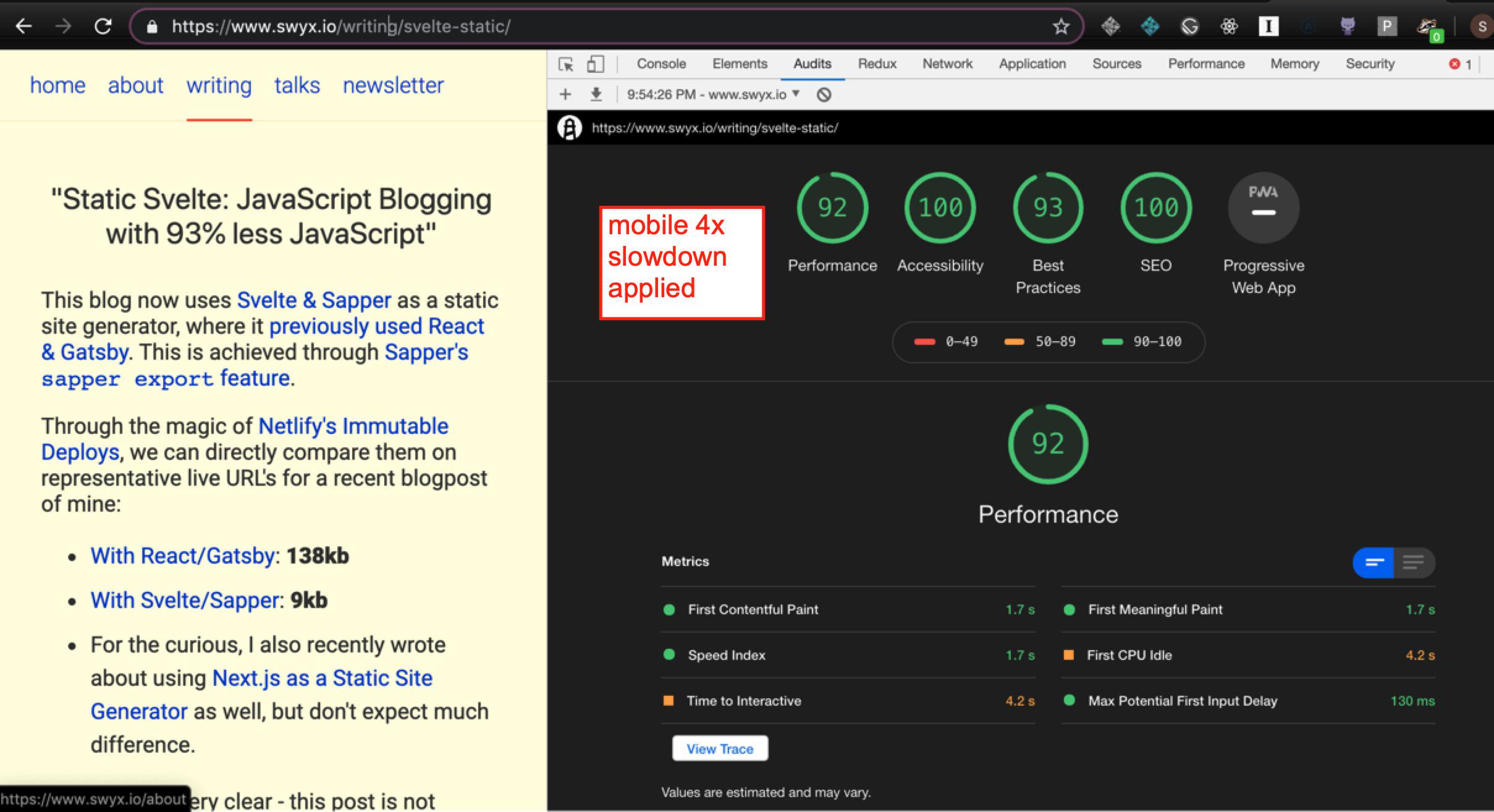
Screenshots
Gatsby version (138kb)

Sapper version (9kb)

Differences and Similarities
Similarities
First, the similarities must be noted, for any reasonable discussion to be had. For example, the reductio ad finem conclusion of the premise of this post is to use any old static site generator like Jekyll or Hugo since it will result in no JS payload.
Costs and Benefits of JS Blogging
However, both Gatsby and Sapper offer clientside rehydration, which makes the subsequent page navigation very fast. It is also easy to:
- progressively add dynamic features without a major refactor
- code in reusable components
- and leverage the vast JS ecosystem to add functionality.
Yes, these are all available through other means. I’m aware.
This is by no means a free tradeoff: as Addy Osmani recently noted, an “uncanny valley” of rehydration exists, and Alex Russell consistently warns that better developer experience is not without its costs. Nicole Sullivan recently noted we don’t even have the language and terminology yet to intelligently discuss tradeoffs between first and subsequent loads. These matter in different contexts.
Syntax Highlighting
As for Sapper JS size, I originally used PrismJS, which adds ~19kb of JS, beacuse as a developer you can pry syntax highlighting from my cold dead hands. So it wouldn’t be fair to compare a site without syntax highlighting to my old site with one.
However, there are no-JS solutions for syntax highlighting, since I don’t intend readers to edit the code in runtime. Andrew Branch recently twote about how to preprocess ALL your syntax-highlighting using some VSCode API’s. I put this off as too complicated, but Khrome tipped me off that the open source shiki library from the Vue ecosystem does the same thing and so I managed to get that in.
High End Lighthouse Score
The default, no throttling Lighthouse scores are totally fine. I’m not going to be read by the next billion users when I don’t even have 200 subscribers on my mailing list. These are all going to vary based on the specific implementation details of the site (in particular, how much time/effort I spend on it) so don’t pay this too much mind, but not that they’re all… alright. Definitely not a failing grade:
- Gatsby version:
- Performance: 100
- Accessibility: 96
- Best Practices: 93
- SEO: 89
- PWA: yes
- Sapper version:
- Performance: 100
- Accessibility: 100
- Best Practices: 93
- SEO: 89
- PWA: some things missing (i didn’t spend time on a manifest)
Differences
There are material differences in implementation that make the two sites not comparable.
Low End Lighthouse Score
The (mobile, 4x applied throttling) Lighthouse scores tell a somewhat different story. This is the same as we had in the screenshots. So I won’t repeat.
Developer Experience
Time spent getting things to work is an important cost to factor in. Sapper is by far less mature, and not designed to have an upfront content ingestion pipeline with pluggable lifecycles. I spent a significant amount of time coding up the markdown ingestion for my site, which in Gatsby is as trivial as adding a couple of source and transform plugins. It’s another involved process to pipe this data in to templates, made harder by the fact that I had to make my own site generator in the process, but Gatsby is also quite involved where one has to create the right templates and queries and gatsby-node files. Kind of a wash here until Gatsby Themes mature, and even then the lack of a standard format may hurt mass adoption or intra ecosystem compatibility (imagine 2-3 warring factions of Gatsby Themes! Good or bad? Unclear)
There are other missing pieces I have to code up myself as well, for example a PWA or RSS feed plugin.
Image Optimization
As Una Kravets has noted, images are a critically important part of web performance. Gatsby-Image not only preprocesses images to resize them down via standard techniques, but also helps you rapidly load superfast images for a nice progressive upgrade effect. My colleague Phil Hawksworth recently wrote on CSS Tricks about how to achieve your own lazy loading - so you definitely don’t need Gatsby for this - but it is nice to have a blessed, maintained, tested, well documented, adaptable approach.
This Sapper site does not (yet!) do any of that. There are open source Svelte Image components I have yet to investigate.
Styling
Finally, the Sapper site does not use CSS-in-JS. This is a very controversial topic with pros and cons so I put it last. In particular, if you have not spent time appreciating some basic facts of CSS in JS from proponents, as well as some nuances in implementation, then your debate will not be very well informed.
The old site has a Dark Theme Toggle. Also a responsive mobile navigation. This Sapper implementation does not.
However, I expect animations to be a lot easier with Svelte as it is a first class citizen. This frees me up to play a lot more with animations in future.