The Radiating Circles of DX Architecture
How to design an end to end developer journey
This post was originally published on my new dedicated DX site: https://dx.tips/circles
To paraphrase Conway’s law, most companies will ship the developer experience of their org charts. And yet org charts are rarely designed with the user in mind.
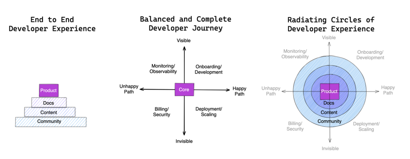
Consider the journey of a typical developer-user: You hear about a tool from either direct advocacy (first-party content) or word of mouth (third-party community). Then you go through the docs, and start interacting with the product. That’s the work of at least 4 teams, all with different priorities and emphases.
If you’ve ever found a blogpost that should have been in the docs, or learned something about the product only from talking to other users, you’ve felt the misalignment that arises when it’s nobody’s job to design for the end-to-end developer experience.
What does it take to design a complete+cohesive journey?
This is an emerging field I’ve been calling DX Architecture. My favorite mental model for it looks like “Radiating Circles”:
The Metalanguage Stack: From Code to Humans
In his excellent talk on Taming the Metalanguage, Cheng Lou first identified the dizzying array of stuff that accumulates around code to make it palatable to humans:
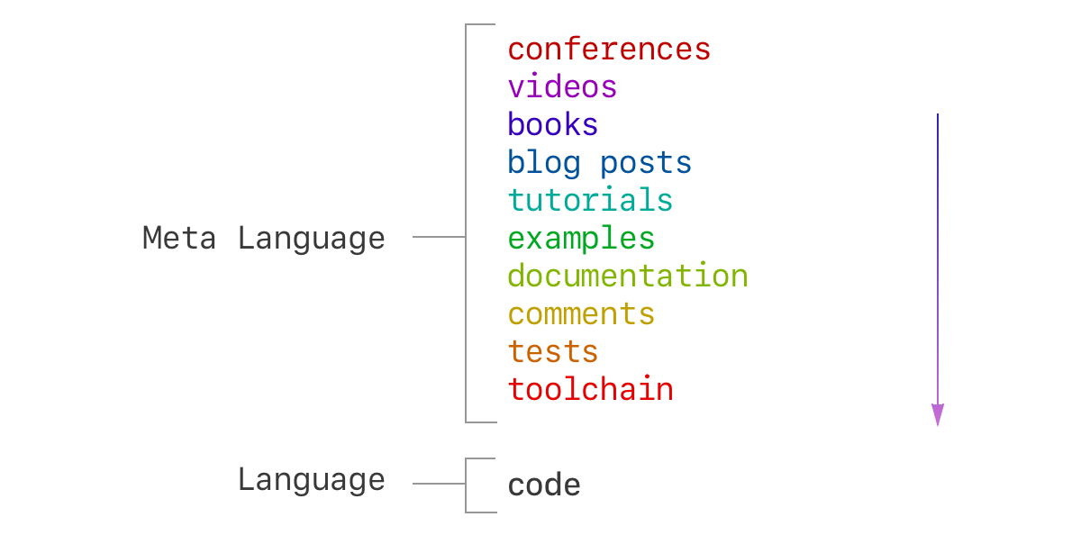
He spoke of metalanguage as a thing to be tamed, which is true:
- The best docs are the docs I don’t have to read, because the product is so intuitive or teaches me as I go
- The best talks and blogposts are the talks and blogposts I don’t have to consume, because the docs clearly said everything there was to be said
- and so on…
But still, you can’t avoid it, and over time you’ll probably want to accumulate more of some things than the other.
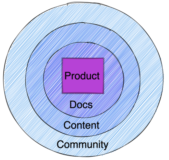
Adjust to taste. 4 layers is merely the simplest I can make it. This concentric circle model just represents an idealized proportion of how much of each type of DX effort you might want; based on your situation, you might want more of one thing and less of another.
For example, Snowflake and Stripe did not bother having fulltime developer relations for their first 5-7 years of existence, whereas SEO-driven SaaS apps should overindex on content rather than community.

Having good docs are non-negotiable, though :)
Examples: The Metalanguage Stack
Some folks often want to see more examples to think through this experience so here’s a non-exhaustive list of parts of your developer experience to think through either when you launch a new product or when looking at your entire offering holistically:
- Product DX
- Scaffolding/Hello World
- API Design
- Error messages (that don’t make me think)
- UI affordances/validation/visual feedback
- Auxiliary Devtools, CLIs/Utilities, Editor Integrations
- Speed, speed, speed. Speed is so important it is its own feature.
- Docs DX
- API Reference
- Tutorials, Guides, Recipes (shared with Content)
- FAQ and Glossary/Conceptual Explanations
- Debugging guide (“Common Errors & How To Fix Them”)
- Readme’s
- Versioning/Migration
- Search experience
- Information Architecture
- Content DX
- Blogposts
- Tutorials, Guides, Recipes (shared with Docs)
- Demos/Workshops
- Shortform Videos
- Longform Videos (including livestream footage and external talks)
- Community DX (More on Community Heat in a previous post)
- Hot Community
- Chat (Slack/Discord)
- Livestream/Meetups/Company Conference
- Social Media (Twitter/LinkedIn/Reddit/etc)
- Cold Community
- Forum posting
- Newsletter
- Quarter/Annual Roundup or Changelog or Survey
- Hot Community
You can pretty much turn some version of this list into a DX Architecture checklist for every launch/update you do.
The Feature Map: Completeness and Sequencing
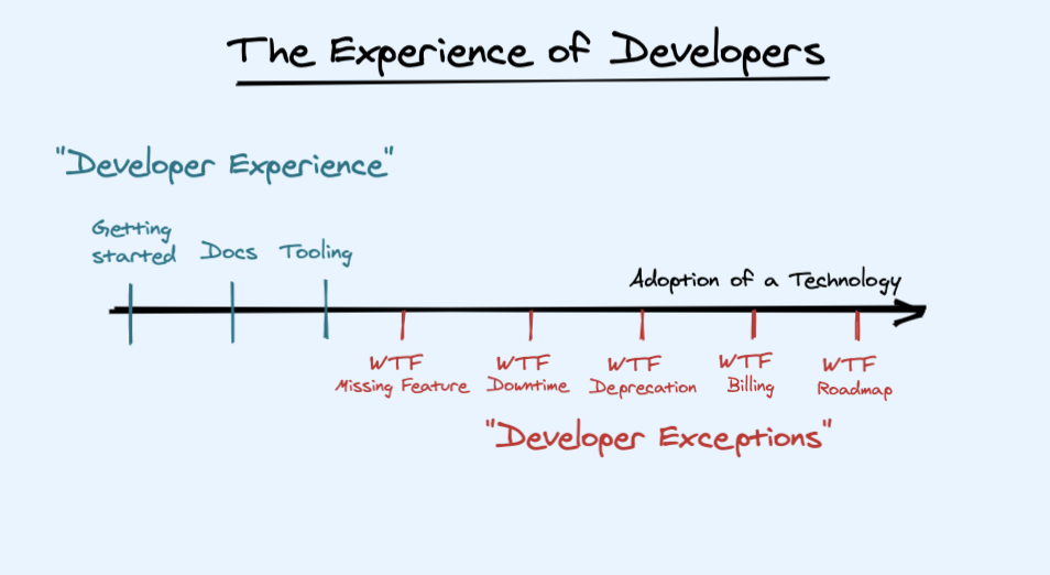
The other Developer Experience ball that often gets dropped is solely focusing on the happy/beginner path.
A lot of developer advocates spend their time only talking about their company’s free tier, and doing “Hello World” ad infinitum. This comes out of the standard view of DevRel as a pure top-of-funnel function, leaving users with a sharp learning curve the moment they need to wander off the paved road.
The central argument of Developer Exception Engineering is that responsible DX should at least briefly prepare the user for the less glamorous, unhappy path.
My second realisation about designing a “complete” developer experience is that everyone should have the same mental map of what the company’s features even are. Everyone has their favorite toy feature, but especially in mature projects, it’s common to have so many features that not everyone even knows all the features or are aligned on what the company wants to offer for each user persona.
The solution for this is Feature Mapping, which I will cover in a future blogpost, but you can see how we applied it at Temporal in this talk. The TL;DR is you want to pick the two most important axes that circumscribe your developer experience and make sure that all your users go through them, or can at least easily find them when they need to.
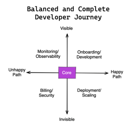
Must it be a 2x2? No - make it a pentagon, or sextagon, dodecahedron, or whatever you want. Just remember that every extra dimension makes it that much harder to remember and therefore less likely to stick.
Simplicity is a feature.
Finally, sequencing, or providing an opinionated path through your feature map, helps put your developer experience on rails rather than making every branching point a tiring choose-your-own-adventure.
Examples: Feature Mapping Axes
Pick from two DX axes that your users care most about:
- Happy path vs Unhappy path
- Developer vs Operator
- User-facing vs Behind-the-scenes
- Positive vs Negative Engineering
- Proprietary cloud vs Open source
- Getting started vs Production (Debugging/Testing/Monitoring/Upgrading/Scaling)
- Core architecture vs Plugin development
Basically, there’s always some version of “eat your vegetables” part of your developer experience that is consistently overlooked, and some version of “small” that looks very different when it is “big”. Figure out what they are and make it a habit to give the overlooked part as much care as the flashier parts of your DX. Your users will appreciate it - and be more successful as a result.
Putting Both Together
Having gone through the exercise of the Metalanguage Stack and the Feature Map, you can simply paste one atop the other, and evaluate your current experience against your ideal:

This is basically a two dimensional checklist that helps you find developer experience gaps and get everyone aligned on what matters to the company and to users!
You might be wondering how to apply this, so here’s a 30 minute exercise:
- Take a devtool company you know well
- Ask what top 4 things serious users should know on the first encounter, and when they adopt for production
- Taking a critical, unsentimental look at each of their community, content, docs, and product:
- How hard was it to answer those questions?
- How good were those answers?
DX starts from the core
Why this concept is known as “Radiating” Circles is that DX Architecture starts from inside-out. The best docs and devrel in the world don’t matter if the product is fundamentally broken. All you’ll have is a leaky bucket - People will try you out and then leave right away with a poor first impression.
So it makes sense that your DX efforts should adjust to maturity: The earlier the product, the more that inner circles should be emphasized over outer ones.
If you have a new product/feature launch coming soon, focus on the product first (API design, error messages, visual feedback, etc), then the docs, then the content, and so on, in that order. Overweighting outer circles when the inner circles aren’t complete will make the experience feel lacking.
In practice, things are never that sequential, so this is more of a guideline of where to spend time. Start as close to the product as possible, then work your way outward, doubling back whenever you have a new product launch or discover some new insight about your user’s needs.
Further Reading
The talk version of this blogpost has more context and explanations on some of the design choices behind these mental models:
%[https://www.youtube.com/watch?v=d9lo-Ej98l4]
Other relevant org chart and design thinking posts:
- DX at Netlify by Sarah Drasner
- DevRel at Vercel by Lee Robinson
*Acknowledgements - thanks to Lee Robinson and Thomas Schranz for reviewing early drafts as well as Pauline Narvas and Mike Nikles for giving the original inspiration to write this up!*